I know that i'm not going to be able to use an actual band name in my magazines for copyright issues. So i have thought of two names i could use for my band:
Flud - I am considering this name because is sounds exactly the same as 'flood' and when a flood happens it is very overpowering and can have a massive affect on peoples lives. Also, the alternative spelling of the name makes the band seem indvidual and unique.
Lense - I am considering this name because lenses help to see things clearer and i want the band to be linked to the fact that they can make their listeners see life and things in life for what they really are through their lyrics and meaningful riffs.
Organisation
I am planning to do some practice photography on tuesday 8th january after school. I will go to digbeth near the Birmingham city centre where they had some white bricked walls that would be good for my background. I am going to use myself because i think that i have the look that i would be aiming at. I'm going to wear a baggy shirt with my sleeves rolled up because that is what the type of audience i'm aiming at would wear and this will appeal to them.
Thursday, 29 November 2012
Wednesday, 28 November 2012
Double Page Spread Research

The image i've been thinking about for my double page spread is something like the two images underneath. I like the idea of a band having a picture in the woods/forest/wilderness because it makes a band look individually and certainly unique as apposed to having a picture in a studio or on the streets. I personally think it makes a band look more outrageous and 'out there' which reflects onto their music, making it look unique which is the effect i want it to have on the reader. I have chosen these two pictures because i would like to base the image i want for my double page spread on these two images. I like the way the woods are in the background in the image with the dog. On the other hand, i love the way bombay bicycle club have used the instruments in the woods making themselves look very different and real at the same time. I also love the idea of the park bench being in the background on the image with bbc and this is something i will definately try and include in my image.
 At the moment, it is likely that i will travel up to cofton park and take the picture for my double page spread there in the woods part of it, with the road in the background. I have chosen to do this because it brings the individualism and realism of the band together which will ultimately make the reader like them.
Thursday, 22 November 2012
Contents Page Research

Wednesday, 21 November 2012
Publication Plan (Draft)
This is a draft of my Publication Plan. It shows what i have decided to include
PUBLICATION PLAN
Your Magazine:
I didn't include one in my practise magazine front cover but I know now that I need to include a Selling line. I might use 'UK's top Indie mag'. It will be a monthly magazine and I will charge £4.00 for my magazine.
Rationale:
My magazine will include interviews from some well known Rock/Indie Bands. It will also include upcoming festival information such as Glastonbury and Reading. I might also have a section for young and upcoming bands so people will buy it to see what new music is coming on to the scene.
Style:
My magazine will be aimed at males and females aged 14-30. It will be aimed at people who like Rock/Indie music and people who are interested in music festivals.
Regular Content:
I had an idea to feature a different band each month that are on tour and the same questions will be asked to each band. These questions will be like: What is the craziest thing that has happened on tour? Which one of the band members is the worst to live and travel with? What are your plans for the future? This way the readers will get to know their favourite bands more so they would be more likely to buy it as they get to know more about popular bands each month.
House Style:
I will keep the same house style throughout the magazine so the magazine looks professional but recognisable at the same time. I don't know my particular style yet but I know i will keep the same font style, size of the font and colour of the magazine throughout the magazine.
Contents Page:
My contents page will feature a different picture of the cover stars (maybe a picture of them playing live) to emphasize that they are the main selling point of the magazine.
Double Page Spread:
One half of the double page spread will be an image of a different band, perhaps doing funny poses or laughing together to make the reader want to read the article on the other side of the double page to see what they found so funny or why they're so happy.
Target Audience Questionnaire
I created a questionnaire to try and target a specific audience. I asked 20 people 5 questions so that I can take it into consideration and sell more copies of my magazine. Here is what I did.
1. What is your favourite style of music?
a) Rock/Indie
b) RnB
c) Rap/Grime
d) Pop/Hip Hop
e) Other
7 people said Rock/Indie, 5 people said Pop/Hip Hop, 5 people said RnB, 1 person said Rap/Grime and 2 people said Other. This is good for me as Rock/Indie is my favourite music as well so i know what to include. I also buy Rock/Indie magazines occasionally so it will be easier to know how to lay it out and what sorts of bands to include. This has helped me to target the audience as i know to use the most popular music genre which is Rock/Indie.
2. How often do you buy music magazines?
a) Never
b) Once a week
c) Once a fortnight
d) Once a month
e) Once a year
8 people said Once a month, 4 people said Once a fortnight, 3 people said Once a year, 3 people said Once a week, 2 people said Never. This has helped to target my audience and make it as popular and credible as popular because I now know that most people buy magazines monthly so I will make my magazine a weekly magazine.
3. How much are you willing to pay for a magazine?
a) £0 - £0.99
b) £1.00 - £2.49
c) £2.50 - £4.99
d) £5.00 - £7.49
e) £7.50 +
9 people said £2.50 - £4.99, 6 people said £1.00 - £2.49, 4 people said £5.00 - £7.49, 1 person said £0.00 - £0.99, 0 people said £7.50. This has really helped me to choose what price tag to put on my magazine because with this information I know what the most popular amount to pay for a magazine is. I will charge people £3.99 for my magazine because that was pretty much half way through the most popular choice in this question.
4. What makes you want to buy a magazine?
a) Cover star/Cover stars
b) Music genre of magazine
c) Cover lines/featured articles
d) Colour
e) Other
10 people said Music genre, 6 people said Cover star/Cover Stars, 2 people said Colour, 2 people said Cover lines/featured articles, 0 people said Other. This was a question that I deliberately used because i wanted to see what was more important, either Music Genre or Cover Star/Cover stars. Even though these two will come together to target a specific audience, the language that would be used by 'Rockers' and 'Indie' people can be used and a slightly less 'Rocky' cover star could be used to target a wider range of audiences' and this is a device I might use.
5. What colours would you like to see in a magazine?
a) Black
b) Red
c) Green
d) White
e) Other
9 people said Red, 6 people said white, 3 people said green, 0 people said Black and 2 people said other. I think the most popular choice was red because that is the colour that is most frequently used in Rock/Indie magazines which was the most popular genre in this questionnaire. I think 6 people said white because the white background would make you focus more on the cover star/cover stars and emphasize their importance and popularity. I am undecided between Red and White so I might try and mix the two together, this has been helpful to pick the colour of my magazine and the colour is very important because it is an important feature of a front cover which is what people will look at when deciding to buy the magazine.
Monday, 19 November 2012
My Practice Magazine Cover Feedback
I got the class to fill out a sheet to tell me they're opinions of my practice magazine front cover.
Positives:
Frequent comments suggests that the original photography was good and the fact that i had a guitar made it look like it would appear on the front cover of NME magazine. Also, i have had a number of comments saying that i have used most of the codes and conventions which is good.
Improvements:
I have had comments saying that i could of used direct mode of address. Also, i could have tried to experiment with the font or researched into existing NME magazines and used the fonts they have used. I have also been told not to use page numbers as they are not used in previous NME magazines so that piece of advice should be very helpful in the future.
Self Assessment:
It was a decent attempt. Looking at the magazine, i think that the dark background, the size of the image and the lack of direct address contributes to it not looking realistic. I now realise that the font is quite basic and i personally feel that the text is a little too big and should be reduced. The photography is blurred and fails to show much of the cover star. However, the feedback from my classmates and leaving it a few days and analysing it again has helped me to see the bad points of my magazine cover a lot clearer and i'll take it all on board.
Thursday, 15 November 2012
Music Genre Research


 These bands are jaws, peace, swim deep and splashh. The look of these bands are all very similar. They all wear baggy clothing to make themselves look very individual. Alot of them also turn their jeans up so that you can see their socks. This also makes them look individual and it would intrigue a reader to be interested in what sort of music they would play. As you can see they all have longish hair, this suggests that they play indie music as you wouldn't see a lot of rappers with long hair. This is the look i want to go for in my magazine because i think it looks cool and it also makes the magazine that bit more interesting and unique compared to any other music magazine.
My Music Magazine Draft (done on word and imported into publisher)

I have done this to practice photography and including the codes and conventions of a magazine. The only thing that i haven't done myself on this is the 'NME' title. This has got me to consider linking the cover lines, the main cover line and the other conventions and how the colour of the photography and the cover lines link and look good.
Wednesday, 14 November 2012
Possible Magazine Name
Possible magazine name:
1. PICK
This would be a good name for my magazine as it sort of suggests that it's the best magazine to 'PICK'.
However, it also links to what guitarists call their plectrums, and this links to the genre of music I want to
illustrate (electric guitar music).
2. AMP
This would be good because everyone who likes guitar music will take note of this and read the
magazine, so the name would help target a suited audience.
3. BANG
This would be a good name for my music magazine because it emplies that the genre is going to be rock
and quit heavy. Also it's quite catchy, and again it helps to target my specific audience.
Tuesday, 13 November 2012
Front Cover, Contents Page and Double Page Spread Analysis


Monday, 12 November 2012
Front Cover, Contents Page and Double Page Spread Analysis

 This is 'classical fm' magazine. The cover star looks very smart, her hair is tidy and her face is very clear. This links with the whole of the front cover as it is neat and tidy. The text font is very clear and easy to read, the plain background makes everything seem very sophisticated. The features in this magazine are all classical music related and the images about the main cover line 'composers at war' suggest this whole idea of being very sophisticated. The language of 'father of the nocturne' suggests that it is aimed at an upper class and adults as the higher classes and adults would use the phrase 'father' and lower classes and most children would use the phrase 'dad'. Just by looking at the two examples of contents pages you can see that it is aimed at a very traditional audience and an older audience as the white background and the easy to read font makes it simple to read and this would suit an older audience. The images clearly target a higher class and older audience just by the images in the contents pages. You can see a man in a suit straight away on one of them and this will straight away appeal to the higher class because they are more likely to wear them for either casual wear or to work. The other one shows two men at a piano, this helps to target the higher classes and older people as they are more likely to listen to piano music than music with electric guitars and drums in. The double page spread shows one half of text and the other of a man in a suit with violins in the background. Violins are usually played by the higher classes so this would straight away aim at higher classes. The text looks very small and this would also help to target the specific audience as the targeted audience would be interested to read more as opposed to a sun newspaper reader which would contain very little text. The simplicity of the font again helps to aim at an older audience as they wouldn't want fancy font where they would struggle to read.
Wednesday, 7 November 2012
Music Magazines' Different Genres and their Target Audiences'

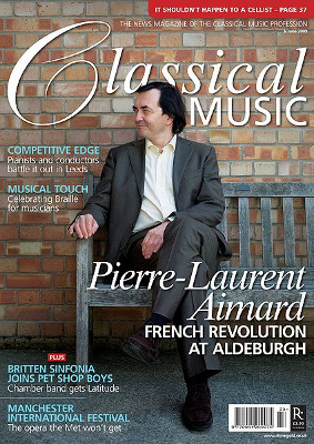
This is the front cover to a 'classical music' magazine. The way the cover star is dressed clearly creates a target audience straight away just by looking at the magazine. He is dressed very formally, in a suit with his hair put back neatly and his posture (sitting with his legs crossed) creates a very sophisticated look and is purposely there to target at a sophisticated audience. It is most likely aimed at an upper class and adults as that sort of people are more likely to wear that sort of clothing as oppose to teenagers and lower classes. The way the 'C' in classical is presented makes it look as though it is handwritten. This helps to aim the magazine at a more sophisticated and older audience because makes it seem more traditional.
I have shown the classical music magazine because it's not what i want to do in mine. I don't want to have the man or men in my magazine dressed formally. On the other hand, i have included the kerrang magazine cover because i would like to go for that messy and untidy effect. I like the fact that it's not bright and colourful but it's not dark at the same time so it gives off an edgy atmosphere and it looks raw and rebellios and would be aimed at younger people, which is what my target audience will be in my magazine.
I have shown the classical music magazine because it's not what i want to do in mine. I don't want to have the man or men in my magazine dressed formally. On the other hand, i have included the kerrang magazine cover because i would like to go for that messy and untidy effect. I like the fact that it's not bright and colourful but it's not dark at the same time so it gives off an edgy atmosphere and it looks raw and rebellios and would be aimed at younger people, which is what my target audience will be in my magazine.
Subscribe to:
Posts (Atom)