Tuesday, 13 November 2012

Front Cover, Contents Page and Double Page Spread Analysis

 This is 'vibe' magazine. A modern magazine aimed at the youth who listen to rap music and rnb music. This magazine is clearly aiming at the specific target audience as the cover star would be well know by the target audience. Also the target audience would be associated with the 'snapback' cap that chris brown is wearing and the youth are also associated with chains and and 'bling'. His posture shows an attitude and this helps to appeal to the target audience as teenagers are often associated with being rebellious and having attitude problems and being and looking very miserable, which is how the cover star looks. The phrase 'fell of' found in one of the cover lines is a slang term for dying out. This shows that it's targeting a specific audience through language, and they're using this technique to engage the reader and o the reader can relate to the magazine. The contents page is mainly filled with a picture of a fairly young person, again with a cap and chains, this re inforces the image they're looking to create. Also the tattoos' also suggests a rebellious attitude as this is aimed at younger people and when you are younger, getting a tattoo is either frowned upon or illegal. In comparison to the 'classical fm' magaizine, you would find a man with a suit on and tidy hair, this you see him with no shirt on and a cap on. This shows how the look, outfit and posture differentiates music genre and target audiences'. Although the double page spread contains alot of text, it shows an image of a young girl with a short dress and big hair. This would attract the audience as the girl in the image is good looking and is showing off her legs and teenage boys would have alot of interest in that. Moreover, the images of her in the background suggests that she is dancing and having a good time, this would link to the target audience as it reflects the teenage social life of going to parties and dressing up for them (mainly girls) and also going to night clubs, where you dance and have a good time

Monday, 12 November 2012

Front Cover, Contents Page and Double Page Spread Analysis

 This is 'classical fm' magazine. The cover star looks very smart, her hair is tidy and her face is very clear. This links with the whole of the front cover as it is neat and tidy. The text font is very clear and easy to read, the plain background makes everything seem very sophisticated. The features in this magazine are all classical music related and the images about the main cover line 'composers at war' suggest this whole idea of being very sophisticated. The language of 'father of the nocturne' suggests that it is aimed at an upper class and adults as the higher classes and adults would use the phrase 'father' and lower classes and most children would use the phrase 'dad'. Just by looking at the two examples of contents pages you can see that it is aimed at a very traditional audience and an older audience as the white background and the easy to read font makes it simple to read and this would suit an older audience. The images clearly target a higher class and older audience just by the images in the contents pages. You can see a man in a suit straight away on one of them and this will straight away appeal to the higher class because they are more likely to wear them for either casual wear or to work. The other one shows two men at a piano, this helps to target the higher classes and older people as they are more likely  to listen to piano music than music with electric guitars and drums in. The double page spread shows one half of text and the other of a man in a suit with violins in the background. Violins are usually played by the higher classes so this would straight away aim at higher classes. The text looks very small and this would also help to target the specific audience as the targeted audience would be interested to read more as opposed to a sun newspaper reader which would contain very little text. The simplicity of the font again helps to aim at an older audience as they wouldn't want fancy font where they would struggle to read.


Wednesday, 7 November 2012

Music Magazines' Different Genres and their Target Audiences'

This is the front cover to a 'kerrang' magazine, a well known rock music magazine. The cover star is the lead singer of Green day, a famous punk/rock band. This magazine is clearly aimed at teenagers who are interested in rock music. We can see this as the cover star is dressed very 'rebelliously' with his shirt undone quite far down and his tie far down as well. We see his hair extremely messy which again promotes this rebellious attitude he is giving us, this would not be appropriate to most adults as they would not dress like this or find this look very enticing. Also, it has 'WTF?!' as a cover line. This is promoting the idea that it is aimed at teenagers as this is the type of slang that would be used on social networking websites, which is predominantly filled with younger people. Moreover, the smashed glassed affect on the masthead further promotes this idea of representing a look which would appeal to teenagers as the type of audience this magazine is aimed would be people who want to be different from everybody else and dress different also. The effect of the masthead makes it look like it has major imperfections. This links to the cover star as his hair is scruffy and his buttons are undone and his tie is down his chest. The title of the magazine links to the music genre of the magazine as 'kerrang' would be the sound a guitar makes when you strum it, and the genre of the magazine would involve electric guitars, this helps to create a target audience by cleverly hinting that is aimed at that specific sort of music in the title.

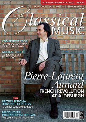
This is the front cover to a 'classical music' magazine. The way the cover star is dressed clearly creates a target audience straight away just by looking at the magazine. He is dressed very formally, in a suit with his hair put back neatly and his posture (sitting with his legs crossed) creates a very sophisticated look and is purposely there to target at a sophisticated audience. It is most likely aimed at an upper class and adults as that sort of people are more likely to wear that sort of clothing as oppose to teenagers and lower classes. The way the 'C' in classical is presented makes it look as though it is handwritten. This helps to aim the magazine at a more sophisticated and older audience because makes it seem more traditional.

I have shown the classical music magazine because it's not what i want to do in mine. I don't want to have the man or men in my magazine dressed formally. On the other hand, i have included the kerrang magazine cover because i would like to go for that messy and untidy effect. I like the fact that it's not bright and colourful but it's not dark at the same time so it gives off an edgy atmosphere and it looks raw and rebellios and would be aimed at younger people, which is what my target audience will be in my magazine.

Sunday, 28 October 2012

Image Evaluation

This is a picture of the band 'The Jam'. The image of the band is widely known as the 'mod' look. This is the image that i will be going for in my magazine. You can see one of the members wearing a green/brown coat known as a 'parka', this coat resemble the mod look that they are going for and it demonstrates what sort of music they play and what their target audience is. The man in the middle has a leather jacket on, skinny trousers and is having a cigarette. This helps to enhance the 'mod' look they're going for because that's what 'mods' would wear and do at that time. You notice that all three of the members have skinny trousers on and longish haircuts, this is the sort of image/genre i will be using in my magazine.

Thursday, 18 October 2012

Self Assessment of 'Practice Magazine Cover' Tasks

1. Have you justified your decisions on your blog?
I have not completed this, i have completed thr potential magazine covers that i was asked to do.

2. How could you make these blog entries better?
M: I could have used a more exciting font and colour for the cover lines and main cover lines. I also could have used less text, it looks quite cramped on the page and i will take this on board when i do my music magazine.
Film X: Again, i feel like i could have used less text on the page as it does look quite cramped. I have difficulty with the main cover line as i was contemplating where to put it and what font i should use. I think it does like quite un-professional and have received feedback from my peers and my teacher so this has helped me to see what i should have done. I do like the cover lines but i think the multi colouring in the text at the top also looks un-professional, this was an experiment that i was contemplating including in my own magazine but after receiving feedback i will probably opt against that device.
Freedom: I did find this hard because of the background. After analysing the magazine in more detail i see that the eye breaking through the barcode suggests the fact that we are always being watched. i have done it based only on Big Brother but i realize now that i could have based it on the troubles with cctv or surveilance issues. I found it hard with the colour of the main cover line but i do feel i chose the best colour. This task was useful because it helped me to see what challenges i am going to face when i complete my magazine.
Pitch: I was really dissappointed with my completion of this magazine cover. I found it very difficult doing this cover, i think i placed the main cover line in the wrong place, the font wasn't suitable and the colour wasn't very good either. This hgas helped me to realise what i don't want to include in my magazine, i really didn't like the colours of the template so i probably wan't include those sorts of colours in my magazine.

Practice Magazine Cover

The last two 'Practice Magazine Cover's i have found quite difficult. I have also been told that i have been packing too much text so i have tried to put less text in. I am still in the process of trying to find my magazine layout and style but these tasks that i have chose to do have defnitely helped me.

Practice Magazine Cover

I have added the the cover lines and main cover lines. I found this template difficult due to the back ground colour and i would probably not use this colour in my magazine. This task was useful because it has helped me to take on a more difficult task but also realize what i don't want to include in my magazine.