
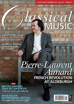
This is the front cover to a 'classical music' magazine. The way the cover star is dressed clearly creates a target audience straight away just by looking at the magazine. He is dressed very formally, in a suit with his hair put back neatly and his posture (sitting with his legs crossed) creates a very sophisticated look and is purposely there to target at a sophisticated audience. It is most likely aimed at an upper class and adults as that sort of people are more likely to wear that sort of clothing as oppose to teenagers and lower classes. The way the 'C' in classical is presented makes it look as though it is handwritten. This helps to aim the magazine at a more sophisticated and older audience because makes it seem more traditional.
I have shown the classical music magazine because it's not what i want to do in mine. I don't want to have the man or men in my magazine dressed formally. On the other hand, i have included the kerrang magazine cover because i would like to go for that messy and untidy effect. I like the fact that it's not bright and colourful but it's not dark at the same time so it gives off an edgy atmosphere and it looks raw and rebellios and would be aimed at younger people, which is what my target audience will be in my magazine.
I have shown the classical music magazine because it's not what i want to do in mine. I don't want to have the man or men in my magazine dressed formally. On the other hand, i have included the kerrang magazine cover because i would like to go for that messy and untidy effect. I like the fact that it's not bright and colourful but it's not dark at the same time so it gives off an edgy atmosphere and it looks raw and rebellios and would be aimed at younger people, which is what my target audience will be in my magazine.
No comments:
Post a Comment